Website Design for the Impatient Entrepreneur
If you’re anything like me, which you probably are, you are impatient when it comes to searching for anything on the internet. If I land on a website, even if it’s a really pretty website, and I can’t figure out what they’re selling and why, chances are I will have a tiny internal meltdown and bounce as fast as I can. Having a pretty website isn’t enough. Your website design should keep your visitors engaged and interested in learning more. Your website is the most effective if you can turn your prospects into paying clients.
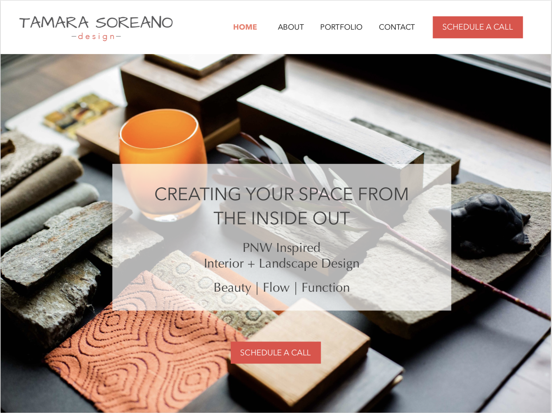
Meet the designer daring to do things differently
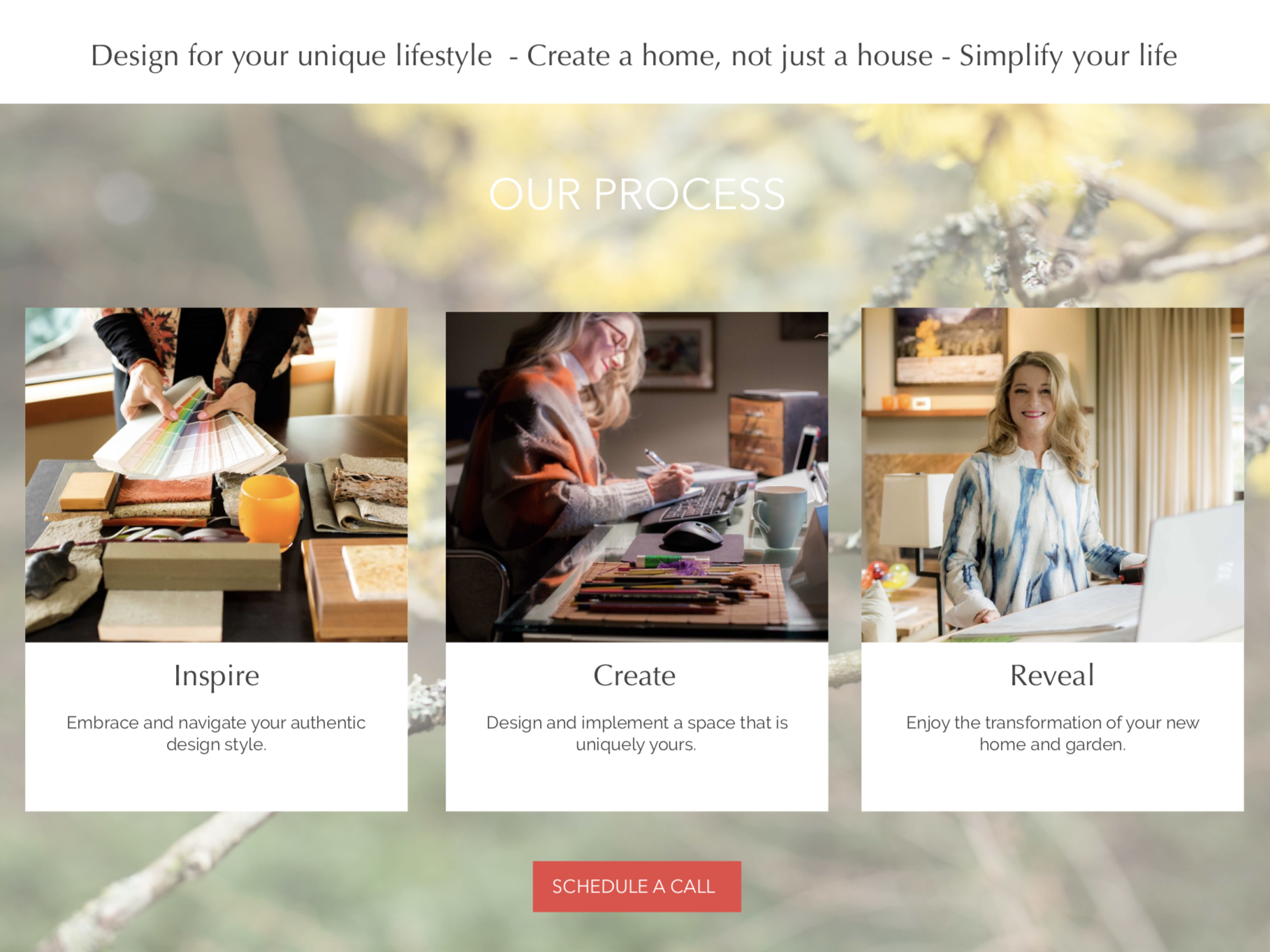
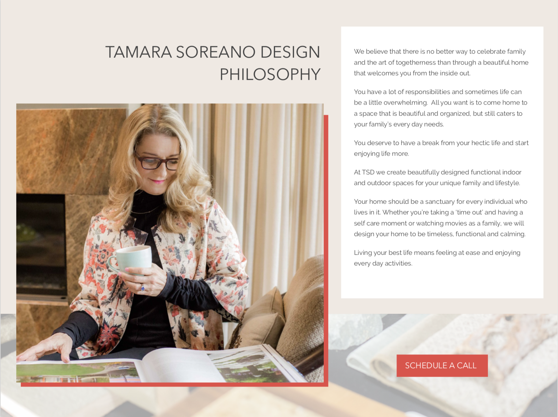
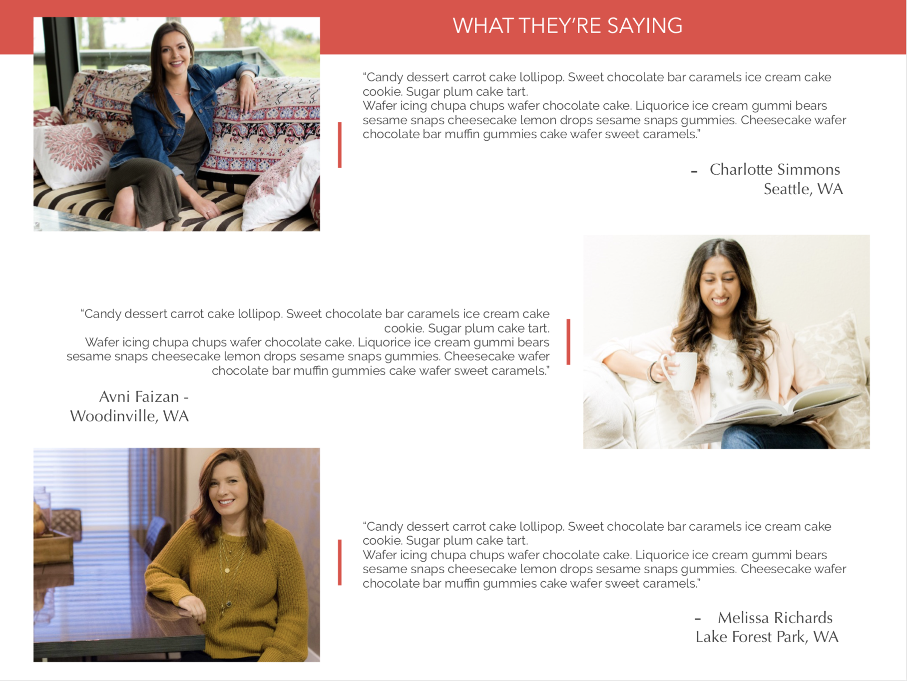
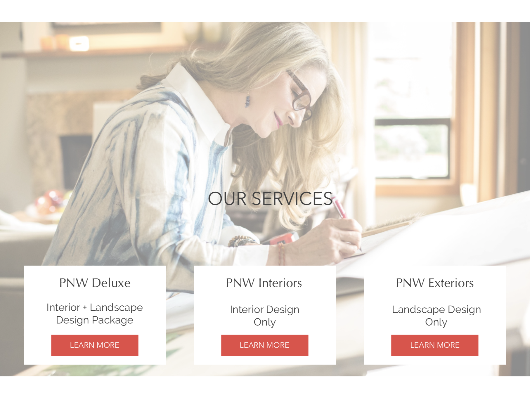
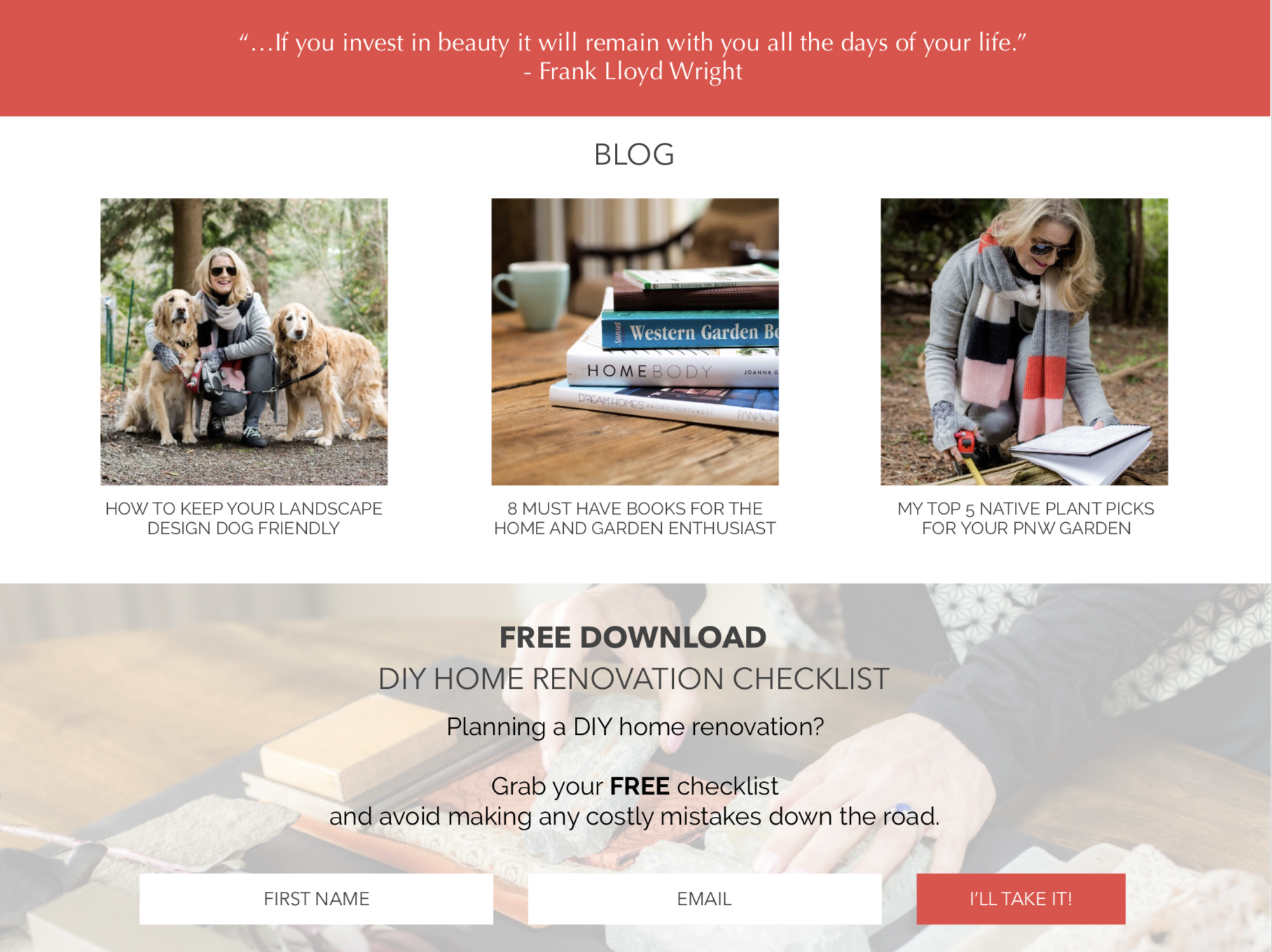
Scroll down to see her new website design
Tamara Soreano is not your typical designer.
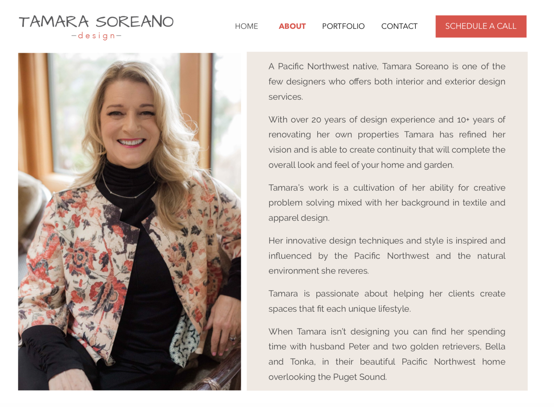
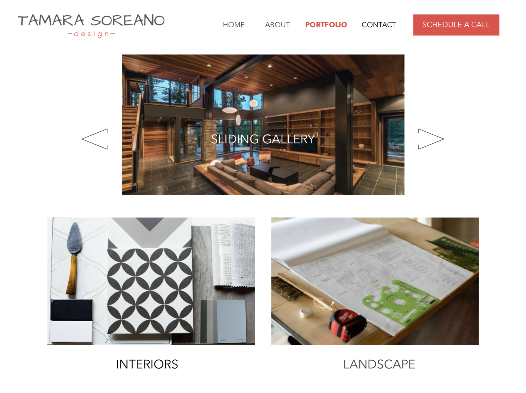
Her super powers are her ability to design both the interior and exterior spaces in your home to create a harmonious, intentional flow between them. This unique talent separates her from others in her industry.
Becoming a “me too” brand was not an option.
If you do a google search for interior designers, you’ll find a lot of the same thing – pretty pictures and a lot of information about them. This is a critical mistake in website design.
The fastest way to bore a prospect? Too much unnecessary information about themselves and not enough compassion for the person visiting the website.
It takes a lot of courage to do things differently, especially when you feel like you have so much riding on the success of your business. But when you have a client-centric website, you will have more people spending more time hanging out on your website because they’re reading about themselves and not about you.
See how Tamara is shifting the paradigm and creating a world within her website that her ideal client can really relate to.
Step 1. Create your mood
Define what your brand should look like.
- How do you want your ideal clients to feel when they come to your website?
- What differentiates you?
- What are the interests of your ideal clients?
Tamara’s brand has an unpretentious, high end Pacific Northwest vibe. So pretty, right?

Step 2. Identify what your ideal client really wants
Why? Because it’s never really about the product or service you offer. It’s about how your product or service is going to make them feel.
Tap into your empathy muscles and help your prospects feel like you really get where they’re coming from.
Step 3. Make things easy for potential clients
As soon as I click onto your page, if your website doesn’t tell me exactly what you do and how you can help me it’s likely I will lose patience trying to figure it out.
Your prospect does not have time to sift and sort through all the details.
When you have too much unnecessary copy on your website about all the things you’ve done and are capable of, you may think you’re giving them all the information they need, but what you’re actually doing is making your prospect work.
Follow these simple rules if you want a proper website design that will work for you and not against you:
- Use inspiring imagery that relates back to your brand
- Get to the point
- Tell us how you will make lives better
- Have a clear call to action…everywhere!
- Productize your services
- Create a compelling Opt-In Offer
- Get testimonials. Let your clients do the talking for you!
About Page
Portfolio Page
Contact Page
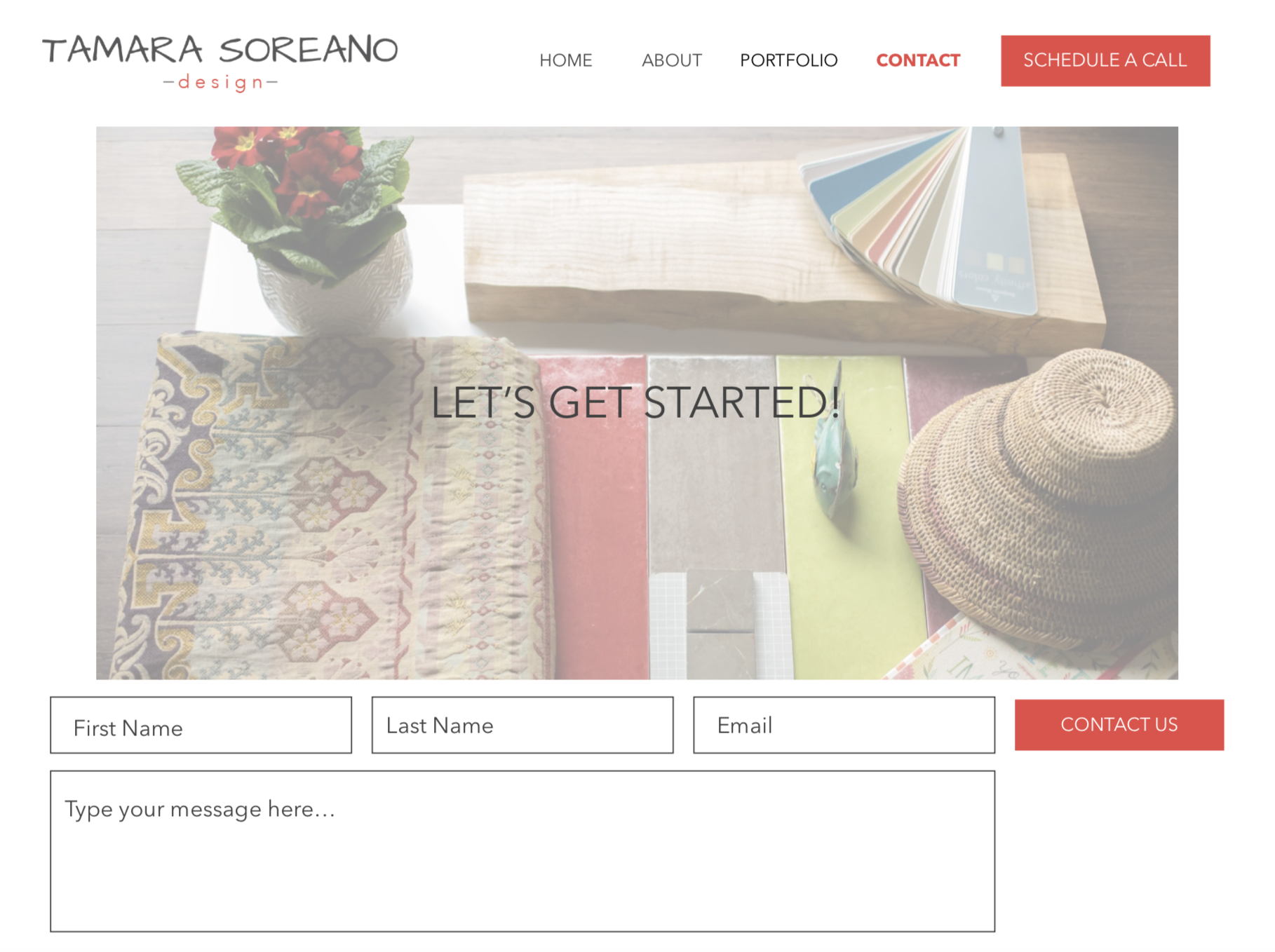
Don’t let all of your gifts and talents go to waste. Take the time to create an intentional website design that will make your ideal client feel seen.
If all of this sounds like it could be difficult for you to execute on your own and you’d like some additional support to refocus your website to be beautiful AND client-centric, check out the brand lab.
I’d love to hear from you. Tell me if you’ve tried any of these tips on your own website and how it’s working out for you! Leave a comment below.


