Brand Transformation Before and After
How this Interior Designer’s Brand Image went from Pretty Good to Pretty Great
Reena came to me because she needed help supporting her brand vision. She is an up and coming Seattle based interior designer who recently took the leap to start her own business.
Obviously, I was incredibly inspired by her work, but her website did not reflect her immense talent, her story or her vision. Most importantly, it was unclear what her message was and who she was trying to message to.
This is a common problem most entrepreneurs find themselves struggling with. How do you align your image with your message so that your ideal client feels like you understand them.
Let me take you through our process:
Before…
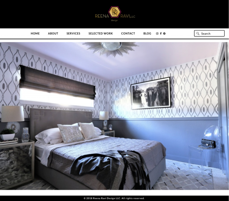
This is Reena’s current home page. It’s a beautiful image of her work, but I’m left a little confused. I have to go in deeper before I learn that she’s an interior designer.
*Pro Tip: If you’re making your ideal client work too hard to figure out what you do, I promise you…you’ve already lost them.
Scroll down for the Big Reveal!
After…
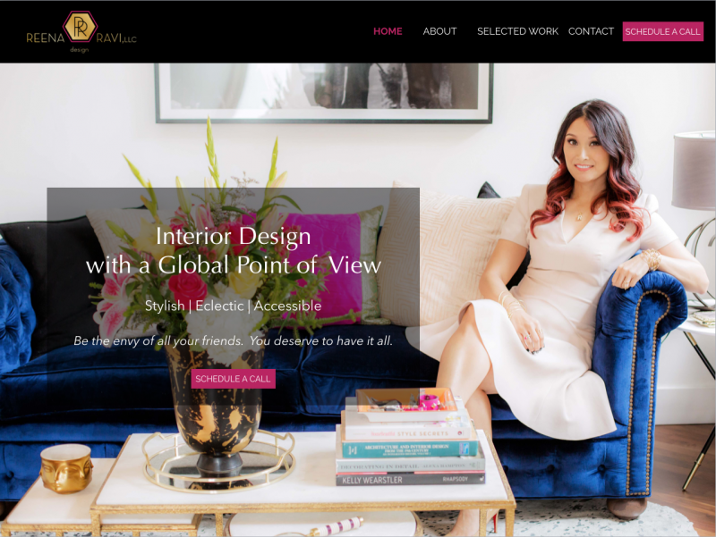
Meet the new and improved Home Page!
Strategy: To develop a brand image that reflects her vision, tells her story, speaks directly to her ideal customer, and builds trust.
Here’s how we did it:
- Clearly defined what it is she does: Interior Design with a Global Point of View
- What her style is: Stylish, Eclectic, Accessible
- What her ideal customer wants to feel: Like the envy of all her friends.
Home Page Continued…
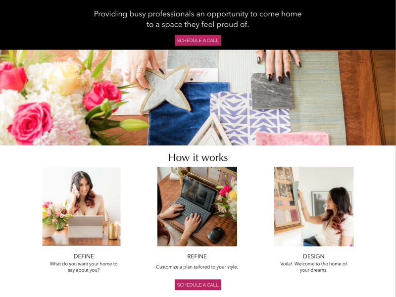
- Who it is she serves: Busy Professionals
- With what: An opportunity to come home to a space she feels proud of.
- How she does it: A clearly defined simple 3 step plan. Define, Refine, Design. Boom!
Home Page Continued…
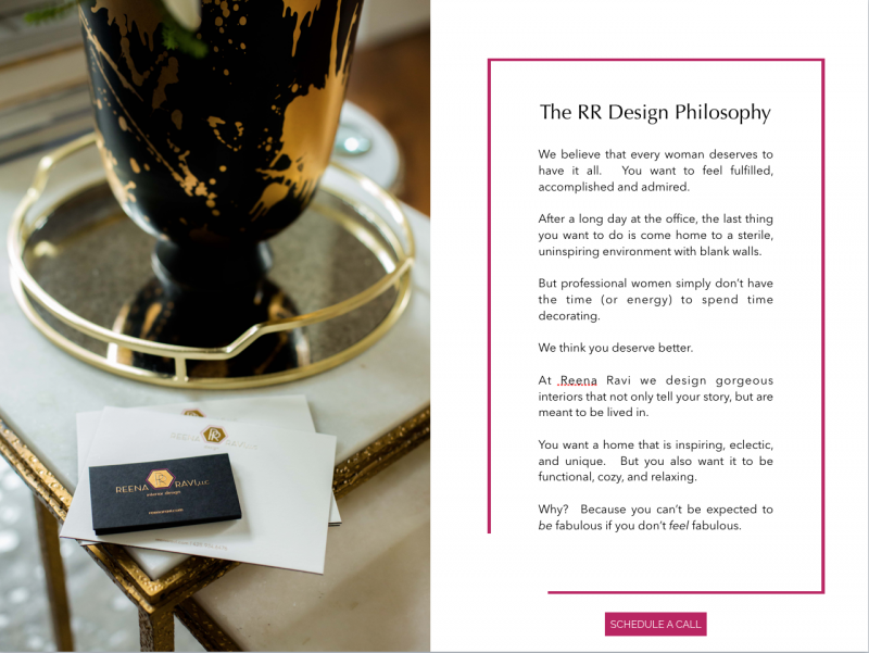
- What she stands for and why: The mission statement
Home Page Continued…
- She can be trusted: Ana Smith had a great experience and highly recommends her.
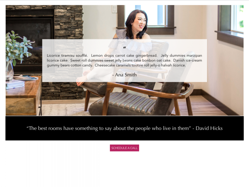
Home Page Continued…
- Her offer: Residential Design or E-Design.
*Pro Tip – Don’t go clogging up your home page with too many words. Send them to a different page where they can read all the fine print.
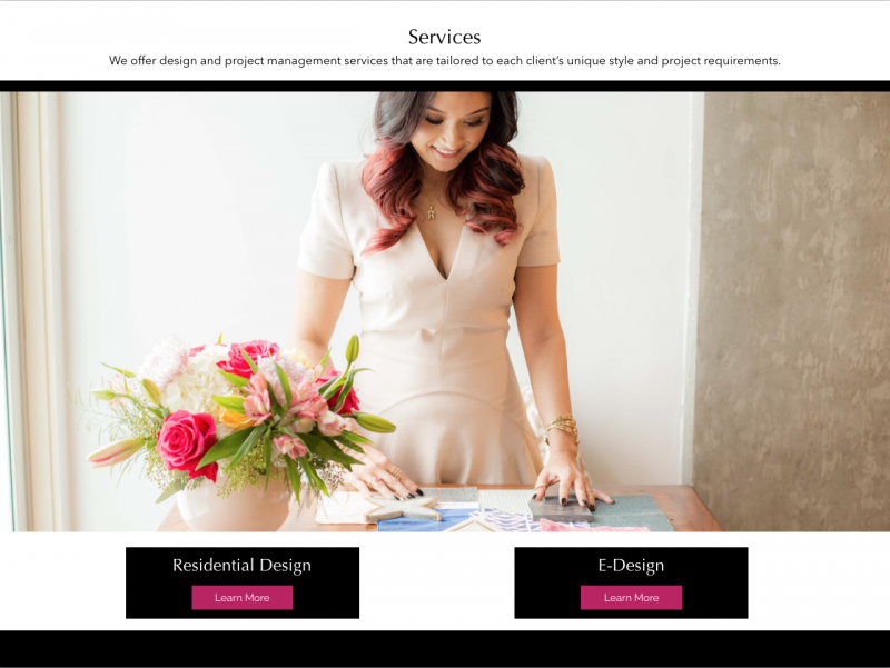
Home Page Continued…
- Adds value: Teaching her ideal customer everything that they’re interested in learning about.
- Lead Magnet: Offering something of high value that her ideal client would LOVE in exchange for an email address.
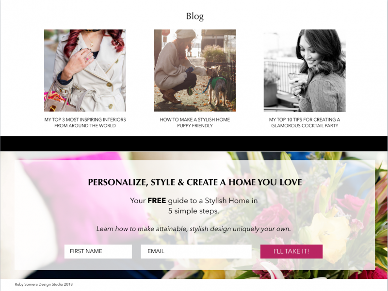
About Page
Forget the degrees, the licenses and the years of doing this or that {YAWN}. She’s letting her ideal customer know that there’s a human behind the brand. She’s relatable, real, and authentic.
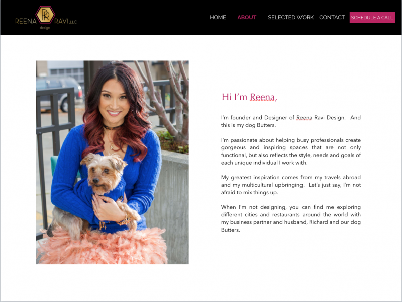
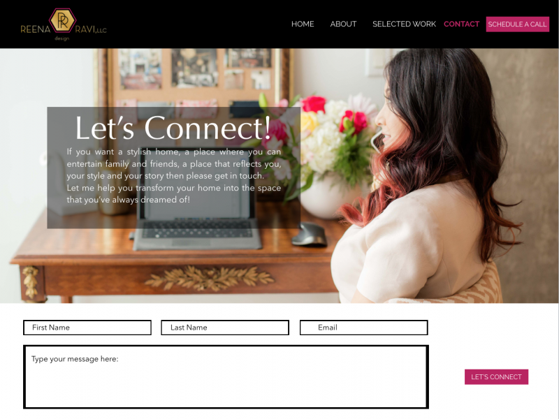
Contact Page
- We’re reminding Reena’s ideal client of her true aspirations: She wants a stylish home that she can entertain in…
Reena was a dream to work with and I couldn’t be more excited to see how her brand is going to develop and grow in 2019.
In my opinion the Reena Ravi Design brand image overhaul was a complete success.
I’d love to hear your thoughts. Do you or have you tried implementing any of these strategies into your own website? If so, I’d love to hear all about it.
Also, if you’re in need of a crazy talented interior designer do give Reena a ring: reenaravi.com


